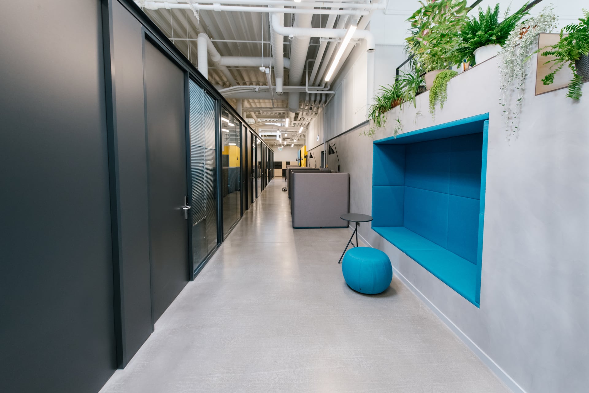
Color can be a powerful psychological tool that affects the way you feel and how you perceive the space around you. The psychology of color theory is also seen in the world of design when it comes to designing offices and other workspaces.
The thought of working in a dull, gray office all day probably makes you feel a little melancholy — this is the brain’s response to color coupled with the emotional impact and mental associations of one’s surroundings. Other colors can evoke calming effects, energizing effects, and even enhance productivity when used properly.
Knowing how to incorporate color psychology principles into designing your modern office can help enhance the feeling of wellbeing in your space, as well as impress and invite-in clients when they visit.
Let’s take a look at how certain colors can elicit specific emotions and how those colors can either enhance or hinder productivity, mood and employee satisfaction.
What is Color Psychology?
The psychology of color has been studied in different fields for many years and there are several principles that comprise this area of research:
- Each color has a specific set of meanings or emotions that it elicits.
- These meanings can either be learned or biologically innate.
- Perception of colors causes evaluation, which in turn leads to color-motivated behavior.
- Colors can influence a person automatically and subconsciously.
- Context can play a key in how a person perceives color.
- Color psychology has been known to even affect us physically. Some hues have been found to increase blood pressure and boost metabolism.
Office Color Psychology
The psychology of color in office design is important particularly for its implications regarding productivity and the mental health of the workers within. Different colors evoke different responses in our brains, both positive and negative. Let’s look at how some of our favorite colors, when put into practical use in an office, can affect employees and which ones may be best for your particular workspace.
Colors and Their Effects
Red
Red is commonly known as the physical color, because it is the one that most readily invokes physical reactions. Some studies have found that red can even increase your heart rate, blood flow, and appetite. It is the color of passion and emotions.
For use in the office, it is preferred to use red sparingly, such as in muted tones or as an accent color in furnishings or decor. If you do want to use red for more of a focal color, consider using it in high activity areas where you want employees to feel confident.
Yellow
Yellow is the color of positivity and confidence, and the right tones of yellow can help to inspire employees. It is a great color for the enhancement of teamwork as it helps evoke feelings of positivity. Yellow mimics natural light and adds perceived room to smaller spaces.
For use in the office, use yellow in meeting rooms and communal spaces to spark positivity and see great results when it comes to group work.
Green
Green is a peaceful color that won’t cause eye fatigue and is associated with helping to create balance between the mind and its emotions. It is also credited with helping boost creativity.
For use in the office, incorporate green as a color scheme in areas where employees tend to work longer hours and are expected to be creative. It’s important that the colors you choose can help to benefit your employees, especially if they work in the same room for long periods of time.
Blue
Blue is one of the most popular colors used in offices today. It is an ideal color for boosting productivity and helps calm and soothe the mind. For that reason, offices tend to choose blue hues for their employees and clients. It is also a great color for aid in helping your workers stay focused and complete the task at hand.
For use in the office, blue can be used liberally, so feel free to use blues as primary tones in any space to maintain a relaxed, calm atmosphere that promotes productivity and peace.
Purple
Purple is seen as the color of ambition and luxury. It is a royal color and it can represent elegance and refinement. Too bold a purple can make the room feel artificial due to it not appearing in nature that often, so using lighter purple hues help keep the interior design conjuring up wisdom and that entrepreneurial spirit.
For use in the office, use purple in areas you want to highlight, such as meeting spaces and foyers where you greet clients.
White
White may be a neutral color but it is anything but boring. White invokes feelings of cleanliness and spaciousness. Practicality comes to mind when using white and you can’t overlook the balance and neutrality it can help create. If you need a small room to look bigger, look no further than white. White helps people conjure up feelings of cleanliness as well.
For use in the office, white is great for restrooms and areas that need to look bigger than they are. Accent with pops of bold color to really highlight your office space.
Enhance Your Space with T2B Interiors
At T2B Commercial Interiors, our designers listen carefully to your design needs, desires and workplace objectives which will help us get to know your brand’s personality as we learn about the unique work culture you have cultivated.
Our designers work with state-of-the art software and will provide you with CET design and renderings to help you understand the design vision and provide valuable input early in the process. Budgets big or small; new space or renovated space; office, healthcare or educational, our designers have the experience to meet all of your needs.
Whether you are in need of color design help, flooring ideas, or furniture for your hard-working employees and guests, contact us today to learn how our designers can meet your needs.

